Results tagged “best practice”
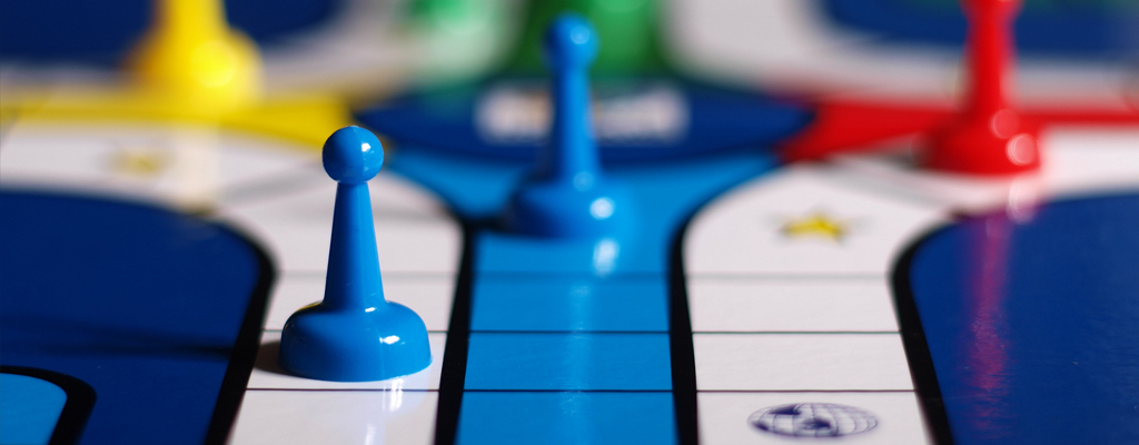
Gamification is a powerful tool to increase engagement in eLearning. It makes the entire learning process more interesting, active and participatory. While it may seem complicated to tackle, there are elements that you can easily add to your eLearning course to create a story-driven experience to excite students. Here are the basic elements you can include to get started:
Protagonist, Antagonist and Journey
The protagonist is a character that is relatable to the learner. The antagonist is the struggle or situation the learner is trying to overcome throughout the course journey. By establishing this basic structure, you can mimic the relationship of the student to the concept they are trying to understand in a way that is engaging.
Power Ups
Think of these as an active rewards system and helpful hints. Power ups are tools or abilities created to help your protagonist solve the puzzle. To the learners, they represent mastery of knowledge, so they can keep track of how they're progressing throughout the course. This is an excellent method to enhance skill-building as well as creating a sense of competition.
Easter Eggs
These help you entice your learners. Easter eggs are interactive items in your content that encourage users to slow down and explore the page and find rewards. They can help prevent users from simply clicking through the information. Think of it this way: Easter eggs help convince your learners to read the whole book instead of just picking up the spark notes.
Implement these three techniques and your eLearning modules will be more effective and engaging by design!

You brand voice is how your company communicates with the world. You need to have a strong personality and point of view and you have to own it. Confidence is key; this is how you get it.
Establish your character
You can't define your voice until you define who you are. Choose three words as the pillars of your brand and continue to build from there. Decide what you stand for, what you're best at and what kind of people you are talking to. Once you establish your values, your passion will do the talking for you.
Decide what makes you authentic
Most brands/products/services are created with the core desire to solve a specific problem. Figure out what you're solving for and why your solution is better than anything else available. Zappo's made a name for themselves not just by selling shoes, but by showcasing their incredible customer service as a differentiator. That's the kind of story you want to tell.
Make yourself an authority
Don't just sell hats, be a hat expert. Blog about the newest innovations in hat making. Send your customers an email with a guide for which hats to wear in what season. Instagram cute pictures of dogs wearing hats. Compliment what you sell with valuable information that makes you a resource for your customers that builds trust and establishes credibility.

Photo by UFV Graphic and Digital Design
At eCoreXperience we've found that the easiest way to ensure great results and communication is to have a clear plan of action that both the client and our team can get excited about. If you are pulling together an RFP or need to reach out to your internal design department, keep these essentials in mind and you will reap the rewards of great planning.
What are the key objectives?
It is crucial to identify the main objective of your project. Without a clear goal in mind, KPIs are impossible to define. Is your team building brand awareness or focusing on event registration? Are you kicking off a social media campaign or generating foot traffic? Narrowing down your focus ahead of interacting with the design team will give you a head start to success.
Who is your target audience? Who are you trying to reach?
At this point in your planning, you should know the segment in the market you'd like to reach. If you are targeting 30-something moms, the look and feel of your design should reflect that demographic. This is an important step that can make or break your design's effectiveness. Knowing whom to target gives the design team a very clear mandate. Without knowing the audience, it is nearly impossible to design effectively. Remember, designers are problem solvers - the more clearly you can explain the task, the more effective the team can be at generating viable solutions.
What do we want the audience to think, feel, or do?
This is closely tied to the last step. For example, if we now know that we're targeting CEOs of small businesses, it is important to understand what the call to action is for that group. Are you providing a white paper on a landing page for them to download? Or are you driving them to a networking event? Those two goals have very different performance indicators, so it is important to know WHO and WHAT actions you are targeting.
What's the single most important thing to say?
If your project were an elevator pitch, what would you emphasize? If you can clearly communicate your main goal in 15-30 seconds, then chances are you have a very good grasp of what needs to be accomplished by the design team. Try to refine your objective to simple, measurable bullet points to make it clear and direct.
What do we need from the creative team? When do we need it?
A list of deliverables and a timeline for their sign-off are crucial to both sides of the design equation. If you have a presentation due next Thursday, be sure to give the design team a milestone to complete earlier in the week to avoid any last minute melt-downs. When in doubt, over-communicate. If your project is suffering from scope creep, make sure to touch base with the project manager and see if any trade offs can be made for mission-critical deliverables. The more proactive you can be, the better.
Who will have final approval on this content from the client side?
This one seems straightforward, but it is surprising how often "design by committee" can delay and cripple projects. Be sure to know how much authority you have to sign off on drafts and deliverables, when you'll be checking in with key stakeholders, and who ultimately has the final yea or nay. The biggest mistake you could make would be to work on something in the dark for months only to be told to scrap all work by senior management as the deadline looms!
We hope this helps walk you through the stages of design planning. If you have any further questions feel free to contact us.
There are hundreds of tools to measure social media and even more opinions about which metrics are the most important. The fact of the matter is that Social Media, though growing at an alarming rate, is still struggling to define standard KPI's across industries and measure them accurately. Not to mention, it's all rather subjective.
Not all companies value the same things
The social media analytics a company pays attention to has less to do with industry standards and more to do with the values of the individual company. Are you driven by sales? You are going to be tracking social conversions. Do you pride yourself on strong customer service? You'll be focused on response rates. Trying to grow a community of supports? Follower counts will be your main driver. It's all about deciding what's important to you.
We still can't put an accurate $ value on social media
Social conversions only measure people that have directly followed the path from one of your social media links to your website and then engaged (either via a purchase, newsletter sign-up or contact form). This leaves a lot of information unaccounted for. Social media sites like Instagram don't direct back to your website seamlessly and it's still not possible to calculate the impact social media has on creating brand awareness and desire to a specific dollar amount. It's frustrating for marketing departments everywhere, but that doesn't mean you should give up on social media. Focus on building your social community and the sales will follow suit, even if you can't quantify them as well as you'd like.
Analytics are only as valuable as what you do with them
The information you get from your analytics should be a huge part of your social listening strategy. Collecting numbers and figures should not just be to appease the C-Suite and show follower counts and conversion. A good social media manager pays attention to things like sentiment and engagement so you can figure out which content is most successful with your audience. And then they make more of it!
1. Too much text
People like pictures, plain and simple. The way users interact with websites, and the world in general, is becoming increasingly visual and there is research to back it up. Visual cues increase engagement. When designing, think about simple graphics that can relay the same messages as cluttered boxes of text. Users will be more engaged with your site and your design will be cleaner and more appealing.
2. Not enough context
The text that you do keep in your web design should be informational and help to support your user in their decision making. For e-commerce in particular, it's important to make sure customers understand what you're trying to sell them. Make it compelling and easy to understand for someone who has never heard of your product before. Be straightforward, but don't be afraid to show some personality too.
3. Overly complicated forms
Forms are unavoidable if you plan on doing any kind of lead generation or communication via your website, but there's no reason to bog them down with useless fields. Asking users to give unnecessary information can be the difference between a new customer or an increased bounce rate. Do you really need someone's middle name or favorite color to send them an e-newsletter? Probably not.
4. Forcing users to register to access basic info
Don't let desire for information capture put up a wall between you and your users. Forcing users to register on your site to access information about your products and services is unnecessary and off putting. They will likely just leave and head to a different website. Think about it as give and take: only ask for their information if you are giving something in return like a newsletter or an order fulfillment. UX is a two way street.
5. Not leaving enough time for user testing
This may seem like a no-brainer, but the best way to make sure your UX is on point is user testing! It should be a priority and you should give yourself ample time for a few rounds of UAT in order to achieve the best possible results. You can always revise as you go and the more work you put in before the initial launch, the less work you will have to do in the long run.
If you've worked on a web project before, you know the power of wireframing. Distilling your requirements and design ideas to essential components is key to crafting a great UX experience. Here are our favorite tools to create your next wireframes in no time:
GoMockingbird
http://gomockingbird.com
Why we love it: There is no learning curve with this tool, which is impressive considering how flexible it can be. We love that it is fully web-based, has a customizable grid and all the standard UI elements that you can drop & drag onto your layout. Of all of the tools we've used, it has the best UX for both new and seasoned wireframers.
WireframeSketcher
http://wireframesketcher.com
Why we love it: If you're comfortable with Adobe Creative Suite, this tool will be intuitive. Within the wireframe builder you can drop & drag stock components, create storyboards and actively link to other pages within the project. We recommend this for those who have more complex information architecture to tackle. A bonus feature is being able to export your wireframes to PDF, HTML, PNG or via a native slideshow.
Balsamiq
http://balsamiq.com
Why we love it: Beyond the drag & drop functionality, Balsamiq also has a "quick add" function where you can type in (and auto-complete) UI elements to speed up the layout process. You can also add images and "sketch" them to give your wireframes a bit more visual interest if you're ready for mockups.
�
In case you've never heard the term before, skeuomorphism in design is a visual holdover of the familiar. It is why your camera app looks like an old camera; why the your phone's calendar looks like a wall calendar, etc. These visual cues usually tell the user what to do with an item that is completely out of its normal context. Once the user is familiar with that behavior, though, the skeuomorphism holds no purpose. Here are 4 reasons why these visual references will actually hurt your UX instead of help it.
Burdening your designs with user assumptions
Want to make a layout intuitive? Skip the skeuomorphism and stick to basic design principles like hierarchy and the grid. Making your reading app look like a bookshelf will communicate that your user should "pick up a book" - but that's about it. Any cool chat function you build in might go undiscovered as it is not automatically related to a shelf and not obvious.
Looking dated.
Wood paneling, stitched leather and binder rings will make your UI look completely out of date in the age of iOS7. Understand the needs and sophistication of your users and cater to them without all of the space-wasting frills.
Limitations in functionality.
In the real world, 3D objects usually serve a single main purpose. You wouldn't expect your bike to also make your coffee in the morning (not yet anyway!) and you wouldn't expect your kitchen chair to have Netflix installed. In this same vein, trapping your UI in skeuomorphism and real world references will limit your creativity. A forward thinking notes app should absolutely handle your larger time management needs, but it won't engage your audience if it looks and functions like a clunky trapper keeper.
Your users will see you as lazy.
In a world of digital possibilities, the choice to reference the real world leaves many users bored. Why not rethink how they should interact and better manage the information you are presenting? The more thoughtful and effortless you make the UX, the more your users will come back for more and ultimately advocate on your behalf.
The web is saturated with ways to get customers' attention, but the power of email marketing is not to be downplayed. Subscription acquisition can be a challenge, and those newsletter templates may make your skin crawl (oh god, please, anything but HTML!) but the end result can be quite rewarding when done well. Here's some simple, user friendly tips to optimize email for your company within minimal effort.
Sign up for an email management service
For as little as $10-15 a month, a service like MailChimp will help you organize all of your subscribers into groups, easily design email blasts, optimize your newsletters for spam filters and track analytics for opens and click-throughs after you hit send.
Create a simple and highly visible call-to-action
Anyone who visits your website should be able to easily sign up for your email newsletter. Make it obvious, make it quick and preferably place it at the top right hand corner of your site where people's eyes are naturally drawn.
Use an incentive
Give people a reason to sign up. Are you an ecommerce site? Offer a coupon or discount code. Are you more of a content creator? Offer a premium white paper download. Whatever you offer, make sure it's automatically sent to new subscribers and that you use a code or link that you can track. This will start the process of turning your subscribers into loyal customers.
Be Clever
It's important that your emails don't feel too invasive. Instead of using aggressive subject lines like "FREE FREE FREE" or "THE ONLY SALE THAT YOU WILL EVER NEED" (which are likely to get picked up by spam filters anyway), try to write something a little more engaging and personal. Email marketing is the perfect place to exercise your brand voice and stand out amongst the spammers.
Track your stats and use them to your advantage
Do emails you send on Friday at 3pm have a 30% higher open-rate than those sent on Monday at 9am? Are image links being clicked on 50% more often than text links? Use this knowledge to your advantage and create your email design and schedule based on it. Simply spending 15 minutes studying the statistics from your previous campaign can yield a higher return for your next one.
In a world of acronym overload, the definitions of UX and UI tend to get muddled. And while both are vital to your website, they are not created equally.
Let's start with some basic definitions.
UI stands for User Interface, so when we talk about UI design, we mean the design of the actual tools and elements that people use to navigate through your website.
UX stands for User Experience. UX designers think about how people use the tools and elements on your website and how it makes them feel.
Think about a really great, comfortable pair of shoes. UI is the height of the heel, the curve of the arch, the pliability of the leather. UX is how you feel when you are walking in them.
But the feeling is just the end goal. UX designers take a deep dive into what makes people interact with websites in a certain way by doing field research, face to face interviews, user testings, statistic analysis and creating personas. It's a process that is deeply rooted in both psychology and function. It's intangible, but also vital.
UI and UX cannot exist without one another, but in terms of accomplishing the goals of your website, UX is the closer. The best UX designers create an experience that makes users feel emotionally connected and supported on your website. UX makes people want to click. UX makes people want to stay. UX makes people want to purchase.
UI is the tool, UX is the interaction. UI is the how, UX is the why. You can't have one without the other, but you've been warned: they are NOT the same.